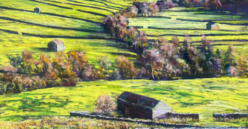
A Yorkshire Year: Part I
Working alongside artists who respect your creative vision and in return who’s work you admire can create something magical to organise together.
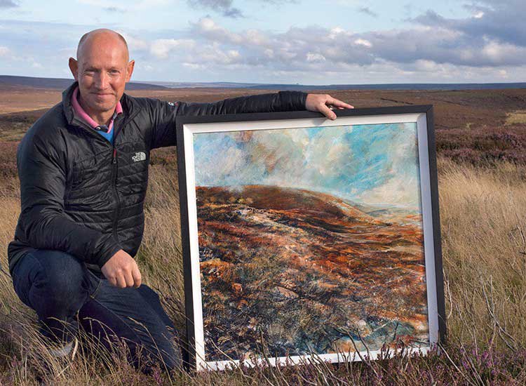
Having qualified with a Bachelor of Arts Degree (with Honours) working for many blue chip clients, to include those in the financial sector for over 30 years, Robert took the decision to become a full time artist when his expressive style of painting became popular and in demand. Following successive shows in London with his work and the regions, together with awards at national open art competitions his unique style has grown in increasing demand.
“Primarily my work is focused on landscape and my beloved northern wild open vistas, dramatic mountain peaks and intimate hidden corners of Moor and Dale. Landscape is the ‘great escape’ a place where my creative vision is thoroughly released with a direct engagement and expressive response to my subject. I immerse myself in the landscape and allow the interplay between what I see but more importantly what I ‘feel’ to create each and every individual piece of work. The evolving landscape – its history its ‘layers’ with a continual interplay between man and nature also forms much of my subject matter.”
“Some drawings and paintings are quickly and energetically created, others are built over time – weeks and months quite often. The work is allowed to rest and ‘breathe’ before joining others is a collection. All my work contain multiple layers and evidence of the push and pull in creative process using a variety of mixed media often combined together with collages and printed layered photographic imagery. More recently Roberts work is moving in a much more semi abstract direction were subject is more important than a literal response to subject. Underpinning everything is honest and expressive good solid drawing!”

Working alongside artists who respect your creative vision and in return who’s work you admire can create something magical to organise together.
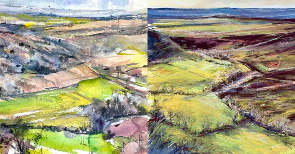
In April last year we ventured into the North York Moors to the famous view known in these parts as ‘The Hole of Horcum’.
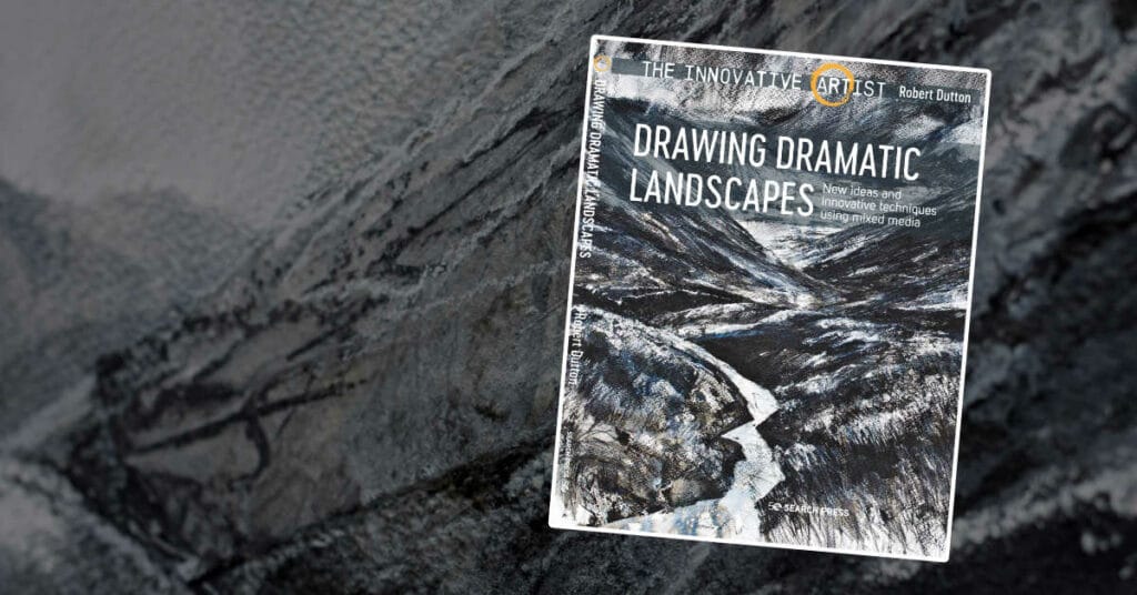
Creative expression with Unison Colour black, white and grey toned pastels.
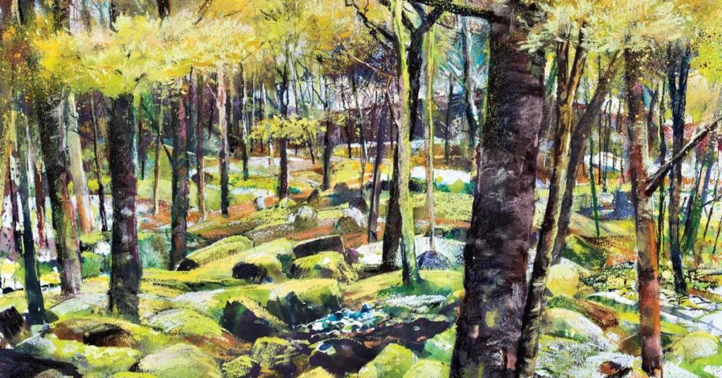
As a professional artist my work now focuses primarily on the landscape and in a very loose, free and expressive way with mixed media and pastel and is always evolving.
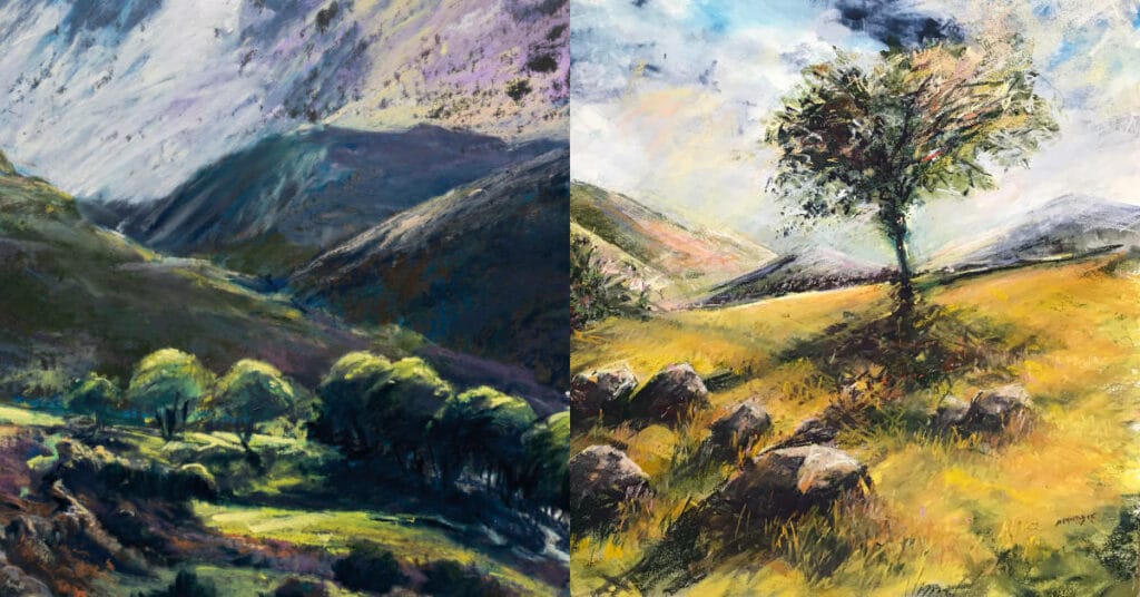
Associate Artists Robert Dutton and Andy Moodie explain how supporting one another as artists helps each to progress using Unison Colour soft pastels.

Associate Artists Robert Dutton and Andy Moodie explain how supporting one another as artists helps each to progress using Unison Colour soft pastels.