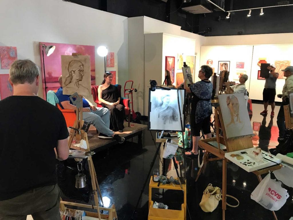
I was recently contacted by Gaye Sekula, a co-ambassador for South Texas for the Portrait Society of America (PSoA). She asked for my help in setting up a “Face-off” event on behalf of PSoA here in Corpus Christi, Texas, where I live. The event was a 3-hour session with two draped models. As I had not had the opportunity to paint from a live model in over a year, I jumped on this. We set the date and made arrangements with the Art Center of Corpus Christi to paint in the spacious Meadows Gallery on July 20, 2019. We hired the beautiful Emily Conway, and snagged an idle husband of one of the participants at the event, and we were off. We had twelve artists participate in the event.
I suppose I should explain a bit about PSoA and the Face-Off events they sponsor. PSoA was founded in 1998 to further the traditions of fine art portraiture and figurative art. You must be a member of PSoA to participate in the event, which is basically a gathering of artists from around the state who come in, set up at the venue and paint live models for several hours. It is not a competition; it IS, however, a wonderful way to network, meet new people and get some model time in. The public is invited to drop in, watch the artists at work and ask questions. The membership to PSoA includes a subscription to International Artist Magazine. It is all easily found on the net if you are interested. (portraitsociety.org).

Art Center of Corpus Christi, TX
I am primarily a pastel artist, so this was an excellent opportunity for me to try my hand at my newly acquired Unison 36 Portrait set of luscious colors. I used this set exclusively during the PSoA event. I managed to complete two paintings of Emily.


My painting. Emily I, painted fast and loose and tried not to get bogged down in the details or over-work the pieces.
It is always a challenge to use a limited palette – if you can call 36 pieces a limited palette! (Which I do, because my usual palette covers a 24” x 48” rolling table top.) But I found this set to be very accommodating.

The colors in this set are warm and vibrant. I painted on Art Spectrum Colourfix Elephant Grey, so my mids were pretty much already established. I did my best to follow Margaret Dyer’s process of establishing mids, then darks, then mids again, then lights, before going back and concentrating on warms and cools for variety and interest. The Unison 36 Portrait set provided nice contrasts. The darks are so pretty and the flesh tones are warm and mellow. I found myself wanting to use every color in the set. Every color and value I needed was at hand, and the end result was a nicely contrasted painting that was harmonious and vibrant.


Unison Pastels are a favorite of mine. I like the wide range of colors they offer and the sticks are soft and buttery, but not easily broken with pressure. I use a wide variety of Unison Colors in my studio and am very happy with this set of portrait colors.
As it turned out, and probably because I set up my gear on the perimeter of the group, I spent a lot of time talking to people explaining my process, my tools, and the colors. I enjoy this part of my work as an artist almost as much as I enjoy the process of creating a piece of work. I try to excite others about not only my own work, but about the creative process as well. So many people come up to me and say, “I can’t draw.” Or, “I’m just not creative.” I always disagree and do my best to help them see how much of what they already do in their lives is creative, and that it simply takes a change in how they look at things to realize that the creative force runs through them, as well.
So, thank you, Gaye, for recruiting me to help with this event. Thank you to the Art Center of Corpus Christi for providing the venue. And thank you to Unison Pastels for this yummy set of portrait colors!