What if?

By Tracey Maras
7th August, 2019

Isn’t it exciting when you stumble onto something that is totally new?  That is what happened when a colleague and I were developing a series of workshops on creative underpaintings for pastel.  While experimenting and asking “what if?” the technique of “Floating Pastel” was created.

An underpainting can make a painting even stronger.  It can provide a value roadmap, foster a more dramatic colour scheme, instil colour harmony or add textural interest.  With “Floating Pastel,” I discovered that it could provide all of these elements as well as adding a sense of depth and dimension to my paintings.

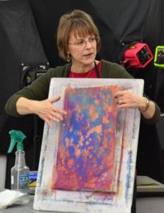
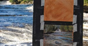
Having experimented with a variety of papers, I have found that this technique works best with UART because of its ability to handle liquid mediums.  After taping down the paper, I lightly apply pastel (single colour or a few colours, 2 or 3 maximum).

The pastel is then liquefied with Isopropyl Alcohol and brushed onto the paper.

Once dry, and working on a flat table, I brush a light glazing of water across the paper. Using a drywall sanding mesh, I grind a fine layer of pastel dust (Nupastel or Rembrandt) onto the sheen of water. (I wear a dust mask and work in a room that is well-ventilated.)

Two or three analogous colours work well when applying the “floating” pastel dust.​
While the surface is still wet, I take an eye dropper and drop 91% Isopropyl Alcohol across the surface, which repels the floating pastel dust, creating a colourful, abstracted underpainting.​
Once dry, I proceed with applying pastel as I would with any painting. The flowers begin by painting the negative space of the background while laying in darkest colour values.​
I then progress to the mid-values…
…and the light values.
Throughout this process, I choose how much of the abstracted underpainting will show through.  The final details are added to complete “Stephanie’s Surprise”.

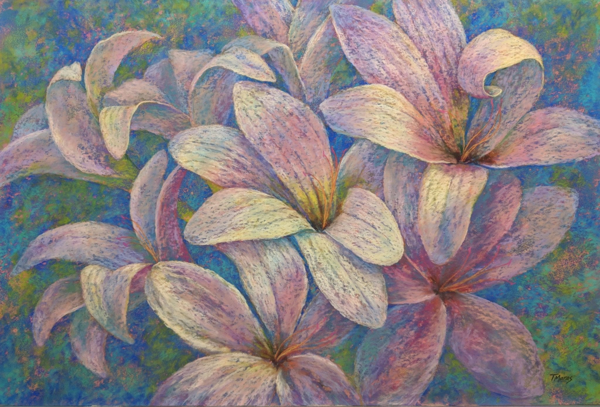
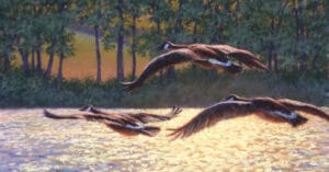
This 2×3 ft. painting was completed on UART 500 using Unison pastels.

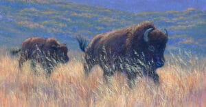
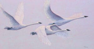
This technique has helped me become more painterly in my approach as I have to incorporate the surprise of colour and texture that results from the underpainting process.  While first utilising it in floral paintings because of its ability to give the flower petals a translucent appearance, I have since used this technique for landscapes and wildlife subjects.  It is exciting to think of all of the possibilities, just by asking “what if?”

Read the sequel to this blog – What if? Part II, here.

Tracey Maras

Unison Colour Associate Artist

www.traceymaras.com
Tracey maras profile photo

1 comment

Leave your comment

Colour Chart Guidance

We believe the colours in our web based colour chart are a faithful representation of our pastel range. But with any colours portrayed on the internet, there’s a whole heap of variables which mean that what you see, may not be what we see. That said, there’s some things that can be done to mitigate some of the variance.

Mobile phone and tablet screens tend to be pretty good for colour, so they’re always worth using, when viewing our colour chart.

We hate to say it, but cheaper computer displays, including laptops, can be rather hit and miss, in both colour and contrast, so they might not reveal the depth of the colour, as well as the true tone.

If you’re really keen on getting your computer up to speed on colour representation, you can use a calibration device to reach your display's fullest potential.

With all that said, if you think we’re way off the mark with any of the colours then, by all means let us know, and we’ll give it another shot.