Inspiration can come from anywhere and at any time. But rarely does our source of inspiration provide us with perfection. Whether the source of inspiration is a scene directly in front of us or captured in a reference photo, it almost always will require modification. And to make it truly our own, we should be modifying it. We should be asking ourselves “How can I make this better?” and “How can I make it communicate what I want to say?”
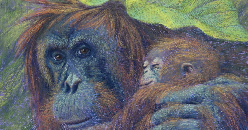
On a recent visit to a zoo, I captured several photos of an adult orangutan snuggling with a youngster, both huddled beneath a burlap sack. I was entranced as I watched their tender interactions. However, my photos were less than ideal. The orangutans were behind an angled double-paned window that was splattered with dried rain drops. And the youngster kept its face turned towards the adult during their interactions.

Back in my studio, it was time to answer those two questions. How could I make the scene better and what did I want to say? Since I was touched by their interactions, that was what I wanted to communicate. But I needed the interactions to be more obvious when attempting to capture a single moment in a painting.
I worked out the design through small (2×3”) thumbnail sketches. Making the scene more intimate, I moved the orangutans closer together. To strengthen the concept of the relationship between them, I decided to make the youngster a baby, snuggling into its mother. Reaching the baby’s arm across the foreground would visually lead the viewer’s eyes to the baby’s face.

But even after the initial thumbnail sketches, design changes can occur as the concept develops. Incorporating a large tropical leaf under which they sheltered would serve as a line leading back to the left across the top of the page, thereby creating a circular composition that keeps the viewer’s eyes moving around the scene and encircling the mother and baby.
I decided to keep the scene in a low key of lighting to convey the sense of them being deep in the rainforest, secluded and sheltered.
To make the design changes, additional research was needed beyond my time spent observing their interactions and my reference photos. Research included the appearance and anatomical differences of a baby compared to a youngster orangutan. To establish the environment, research was needed to determine the correct type of foliage and to establish the ambient lighting and how it would reflect color onto the orangutans.
My final decision was to have the mother looking directly at the viewer, as if to say, “Protect the Precious.”

We should always be vigilant for those moments of inspiration that will lead to that next painting. But planning, research, and design will make the painting truly your own voice.

2 comments
Rita
Beautiful work! Just received my very first box of unison portrait pastels. I keep looking at them and don’t know where to start.
Thankyou for your inspiration.
Tracey Maras
Opening that first box of Unison pastels is such a wonderful moment! Such luscious colors and every one so pristine and perfect. But know that you’ll experience even more wonderful moments when you put pastel to paper. Enjoy your journey!