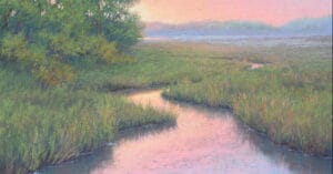
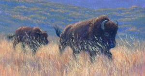
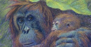
In my previous blog I presented two questions when beginning any painting, “How can I make this better?” and “How can I make it communicate what I want to say?” Whether it begins as an image in our mind, in front of us from real life, or from a reference photo, these questions are paramount to a successful painting.
Since many of my paintings incorporate wildlife, I must frequently rely on quickly taken photos to capture the moment. Rarely, if ever, are these photos usable as stand-alone photos. Many times, they have been taken through a car window, panning rapidly to try to keep up with an animal that is running/flying, or including an environment that is not ideal for a finished painting. Therefore, my reference photos serve as the initial inspiration only.
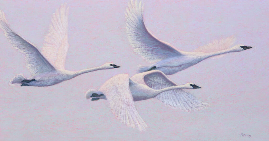
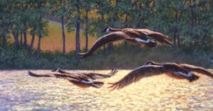
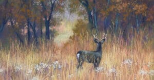
Take for example an unexpected encounter this Spring. On a drive to visit my parents, we spotted a flock of swans pausing to rest in a bare field before they continued their migration Northward. In anticipation of these types of moments, I almost always have my camera at my side. My husband pulled over for a few minutes so I could snap some quick photos. Then on our return visit home, he drove back the same route just in case they were still in the field. Not only was I able to get photos as they rested, but also as they took flight.


As seen in the photos, overcast light and muddy fields were not the most inspiring for a dramatic painting. But with about 30 photos at my disposal, I was ready to address the questions of “what did I want to communicate” and “how could I make it better.”
I worked out several designs through small (2×3”) thumbnail sketches and have already selected 4 designs for paintings.


That single day’s chance encounter has provided so much inspiration that I cannot say how many paintings will result. But it is exciting to consider where the transformations will lead.


Keep your eyes ever vigilant. Keep your camera handy. Have a sketchbook at the ready. You never know where you will find inspiration. Maybe it will be standing in a muddy field. You just never know.

4 comments
Lori O.
As a fellow wildlife pastelist, I appreciate your comments on using photos as inspiration and a guide! Your swan paintings turned out beautifully…you can sense the flapping and soaring!
Tracey Maras
Thank you Lori! Over the past few years I’ve discovered that if I paint wildlife with a a little looser hand, it helps impart a sense of motion. In the past, attempts to capture every detail imparted in the photo resulted in a static feeling. And if you zoom in on the image, you’ll see that I’ve created a textured ground/surface which also imparts movement. We can take a painting into so many exciting directions if we give ourselves permission to break away from the reference photo.
Star Culp
I especially enjoy reading your posts, Tracey. You’ve taught me so much that I can relate to. And I love your animal paintings. If only I could capture the soul of my subjects the way you do!
Tracey Maras
Star- Thank you so much for your kind words. Your soul and compassion speak through your paintings. You are a dear friend and it is a joy to paint with you each week.