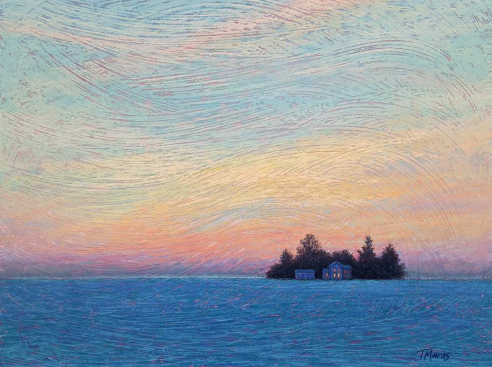
Winter homestead with tracey maras feat

Winter Homestead

Current Status

Not Enrolled

Price

£9.99

Get Started

Painting a Twilight Snow Scene on Textured Ground.

When imagining a winter scene, we usually visualize a scene filled with white. But in the low-light hours of twilight, snow can become a blanket of rich indigo and turquoise blue. Pairing that with the warm highlights of the setting sun reflecting on clouds or the warm light emanating from the windows of a house can create a scene that is colorful and expressive.

While this could be painted on any pastel paper, a textured ground can be used to impart subtle drama to an overall simplified scene of an isolated homestead silhouetted against a twilight sky during winter.

Written tutorial with the following learning outcomes:

  • Design & composition
  • Preparing the painting surface
  • Creating an underpainting
  • Painting the scene utilizing broken color to accentuate texture, dimension, and drama.

Intermediate Level
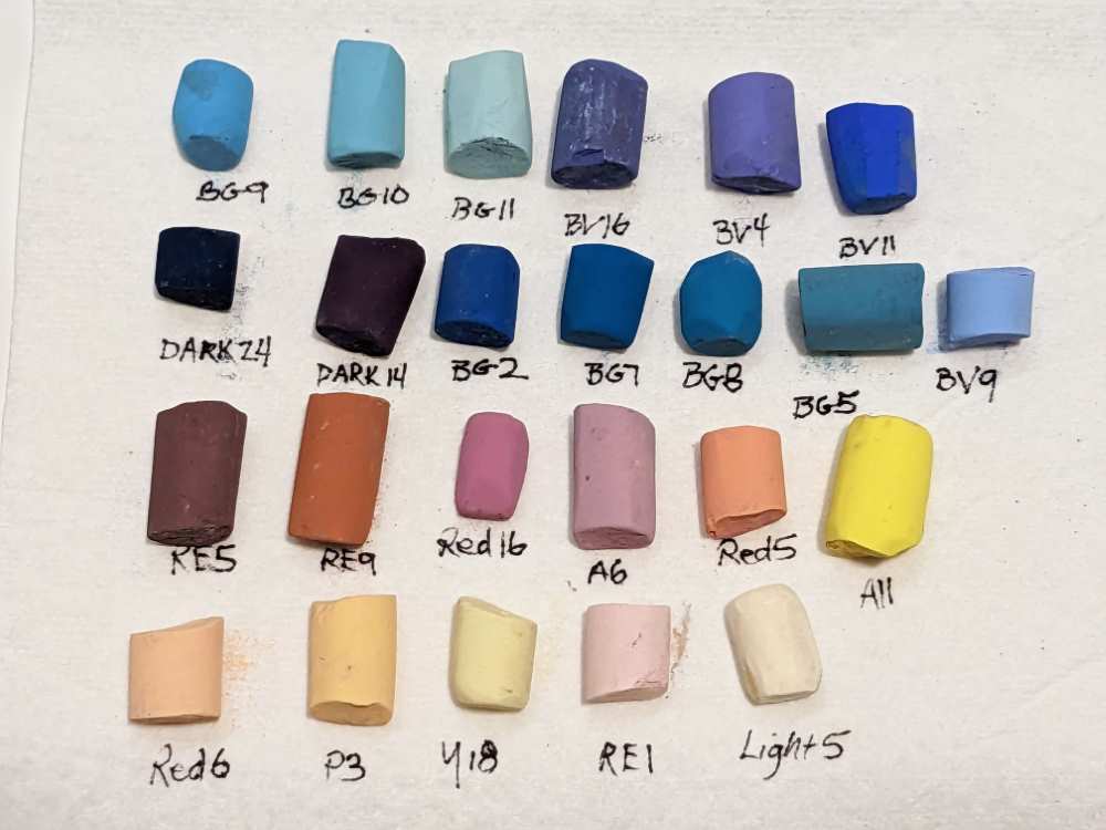
Recommended pastels for Winter Homestead.

Unison Colour pastels

  • Blue Green 2
  • Blue Green 5
  • Blue Green 7
  • Blue Green 8
  • Blue Green 9
  • Blue Green 10
  • Blue Green 11
  • Blue Violet 4
  • Blue Violet 9
  • Blue Violet 11
  • Blue Violet 16
  • Dark 14
  • Dark 24
  • Red Earth 1
  • Red Earth 5
  • Red Earth 9
  • Red 5
  • Red 6
  • Red 16
  • Yellow 18
  • Additional 6
  • Additional 11
  • Portrait 3
  • Light 5 

Other materials

  • 1/8” Gatorboard
  • Golden Fine Pumice Gel (Pastel Ground or Acrylic Gesso can be substituted.)
  • An inexpensive paintbrush
  • Cup
  • Isopropyl alcohol for underpainting
  • 1” to 2” wide brush for the underpainting

Average Review Score:
★★★★★

You must log in and have started this tutorial to submit a review.
Tutorial Content

Introduction
Materials
Reference photo
Stage 1: Design & Composition
Stage 2: Preparing the Painting Surface
Stage 3: Sketch & Underpainting
Stage 4: Beginning with the Sky
Stage 5: The Clouds and Blocking in the Homestead
Stage 6: Building the Clouds
Stage 7: Establishing the Foreground
Stage 8: Time to Assess
Stage 9: The Highlights

Colour Chart Guidance

We believe the colours in our web based colour chart are a faithful representation of our pastel range. But with any colours portrayed on the internet, there’s a whole heap of variables which mean that what you see, may not be what we see. That said, there’s some things that can be done to mitigate some of the variance.

Mobile phone and tablet screens tend to be pretty good for colour, so they’re always worth using, when viewing our colour chart.

We hate to say it, but cheaper computer displays, including laptops, can be rather hit and miss, in both colour and contrast, so they might not reveal the depth of the colour, as well as the true tone.

If you’re really keen on getting your computer up to speed on colour representation, you can use a calibration device to reach your display's fullest potential.

With all that said, if you think we’re way off the mark with any of the colours then, by all means let us know, and we’ll give it another shot.